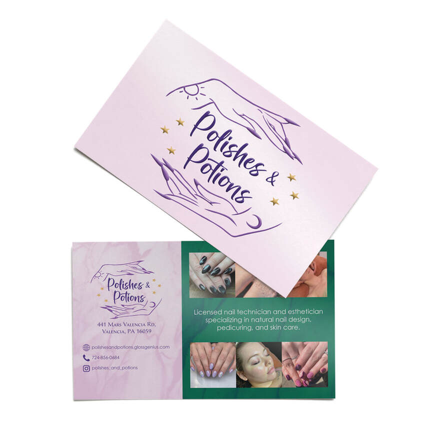
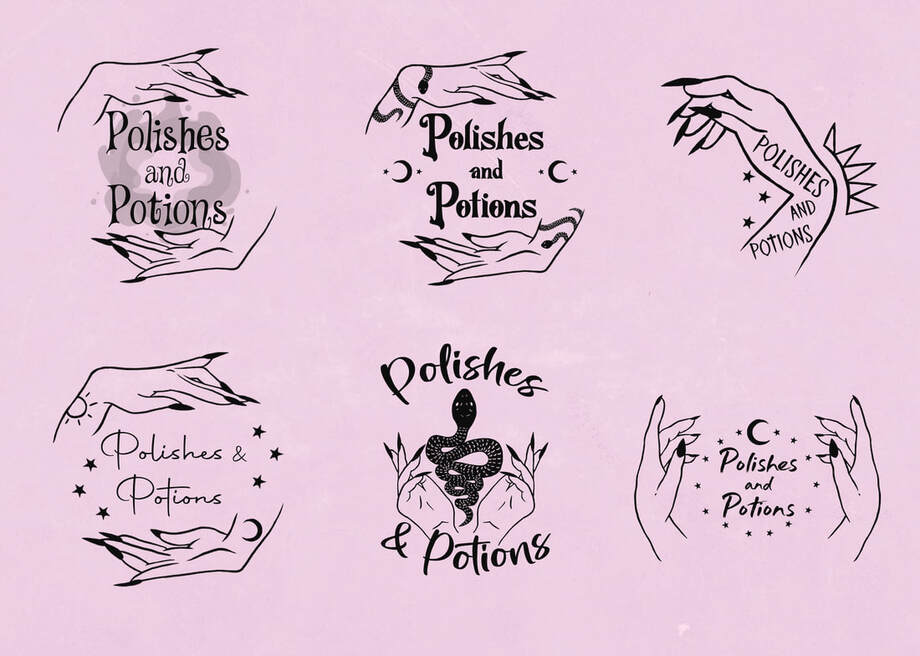
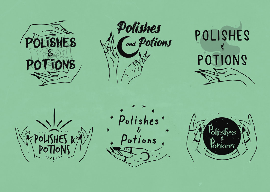
Polishes & Potions is a nail salon I was approached by looking for branding. They wanted a witchy aesthetic, somewhat dark and mysterious, while still feeling feminine and luxurious.


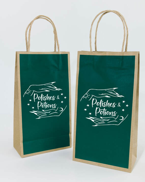
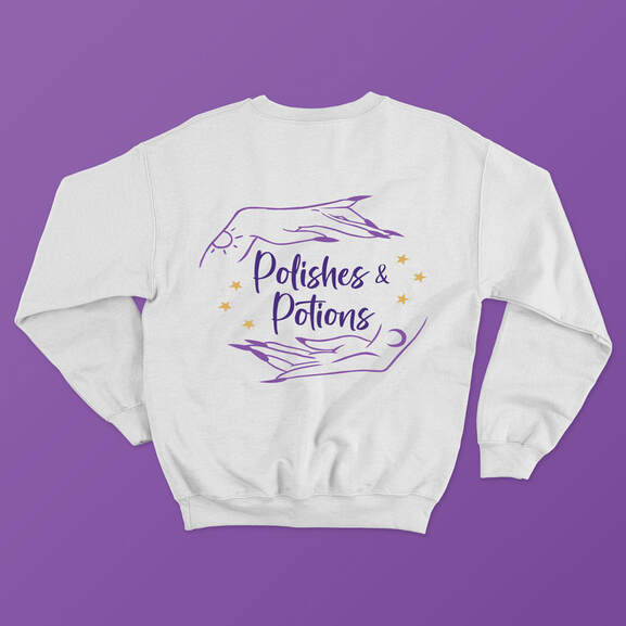
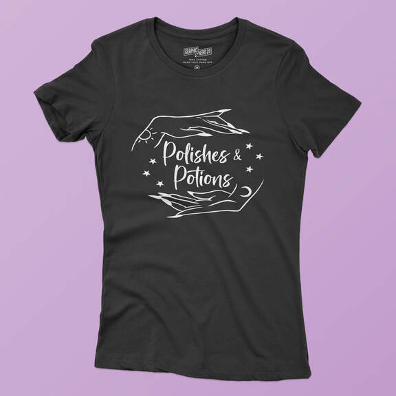
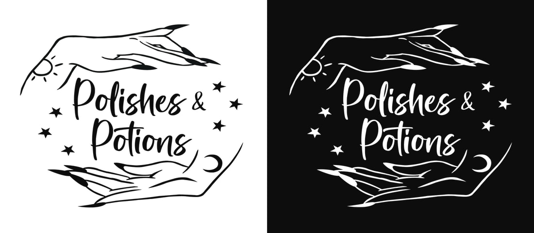
For the final logo, I created a circular effect with the hands, as if they were cradling a crystal ball, which leads the viewer's eye around the design. The client was inspired by purple and green crystal tones, so I chose shades of amethyst for the logo, which I carried throughout the branding, as well as incorporating a jade green as a secondary color in the merchandise. The hands in the logo have sun and moon tattoos to give the brand an edgier, more alternative feeling, going along with the studio's target audience.
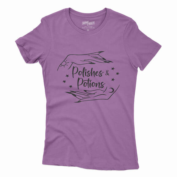
The branding is carried out through business cards, packaging for in-store nail polish purchases, and apparel.